Portfolio PDF
Choose what goes in, then press the button and pick “Save as PDF” in the print window.
Cities are full of things nobody designed to be looked at.

Works
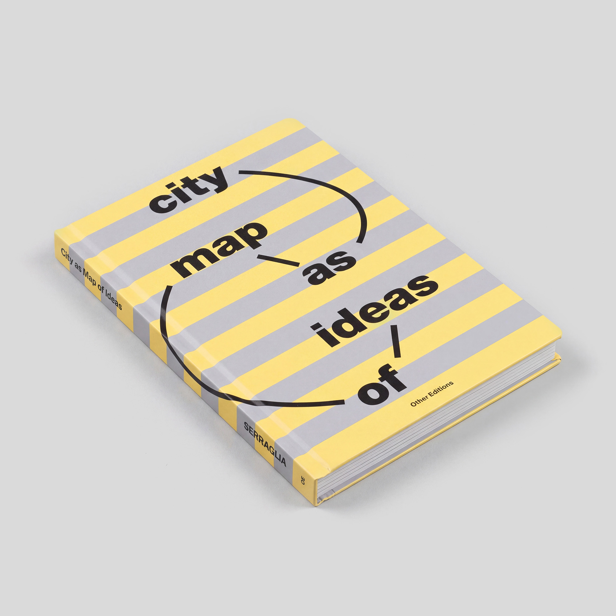
City as Map of Ideas2026
 1 / 5
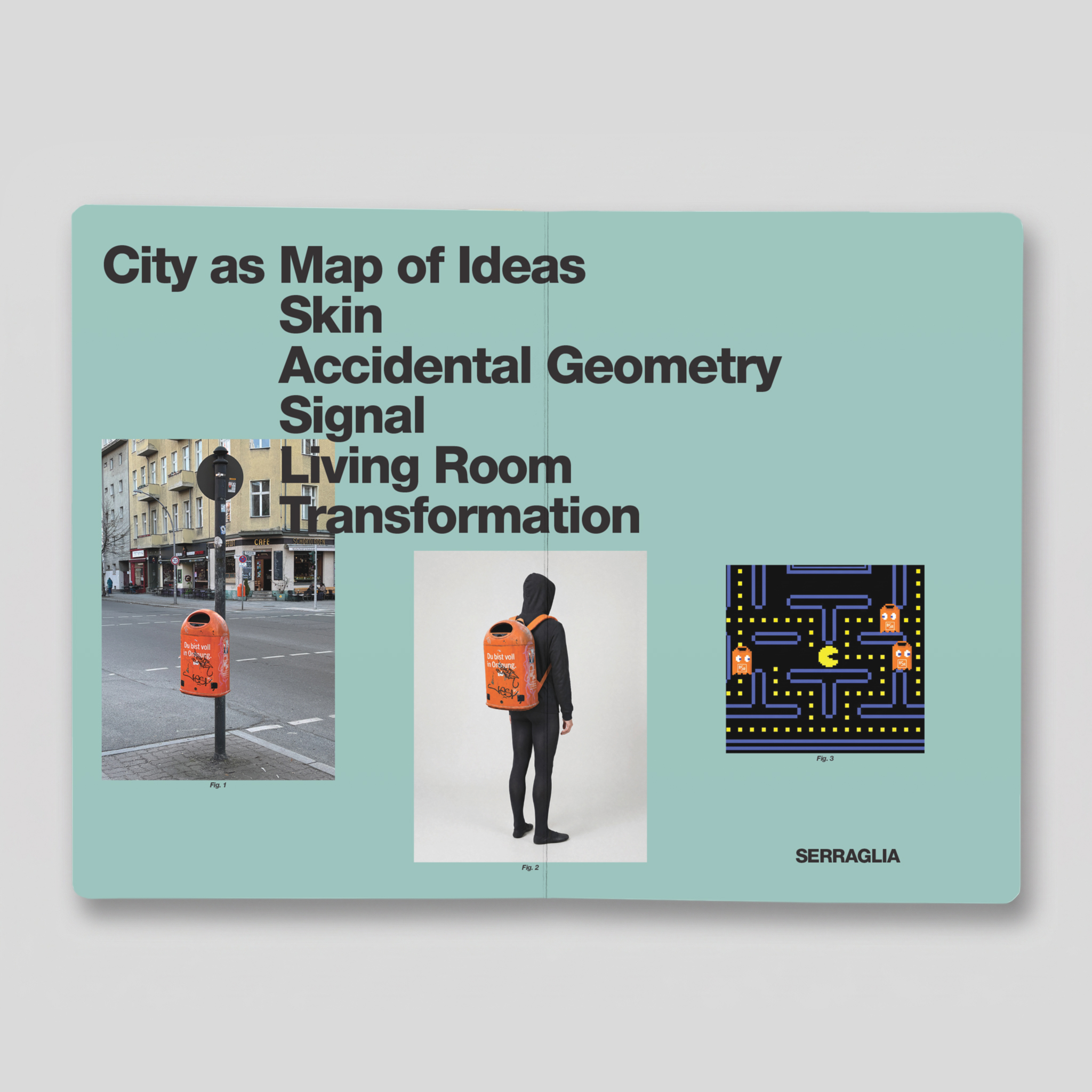
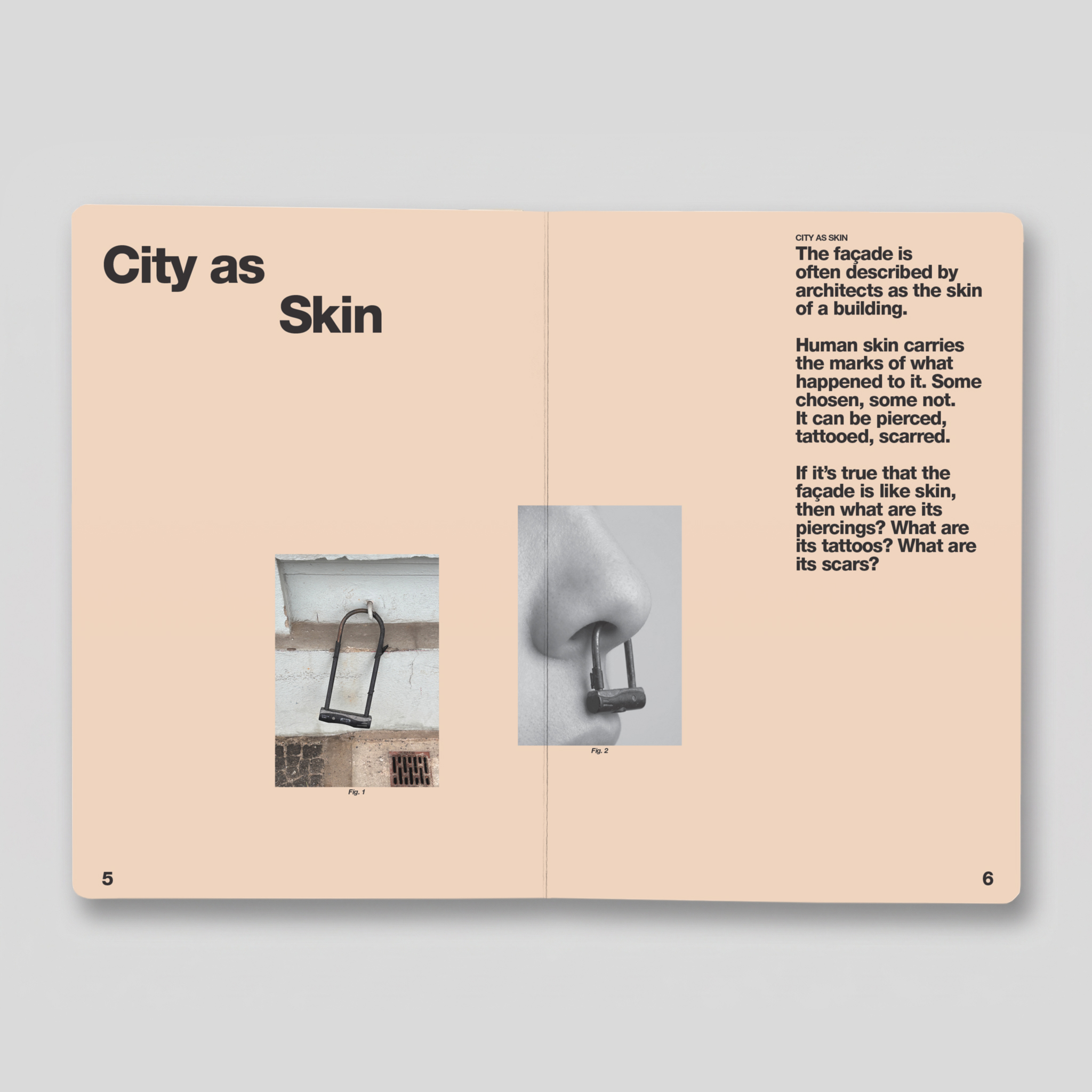
“City as Map of Ideas” is a visual essay that reads the city through observation and association.
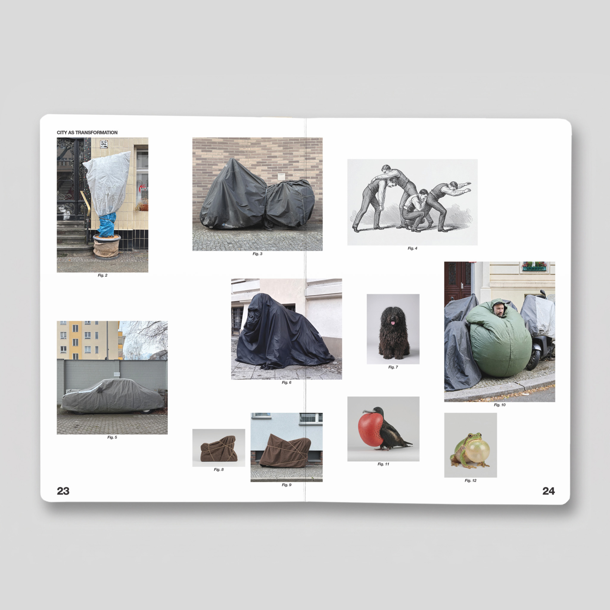
Each of the five chapters starts from a detail found on the streets of Berlin and pairs it with other images. Not to explain it, but to open a connection: a question or a parallel that wasn’t obvious at first.
The format is borrowed from children’s board books, the kind that teach you to see before you learn to read.
The project also includes a series of objects developed from the book.
- Details
- Supported by Stiftung Berliner Leben. Developed during a residency at Urban Nation, Berlin
- Shown
- Urban Nation Projektraum, Berlin, 2026
- Available
- Bookshop
Something Special2026
 1 / 1
“Like 90% of contemporary art, things do not go into museums because they are art. They become art because they end up in museums. This cover works the same way: it doesn’t protect something special, it makes it special.”
- Details
- Part of City as Map of Ideas
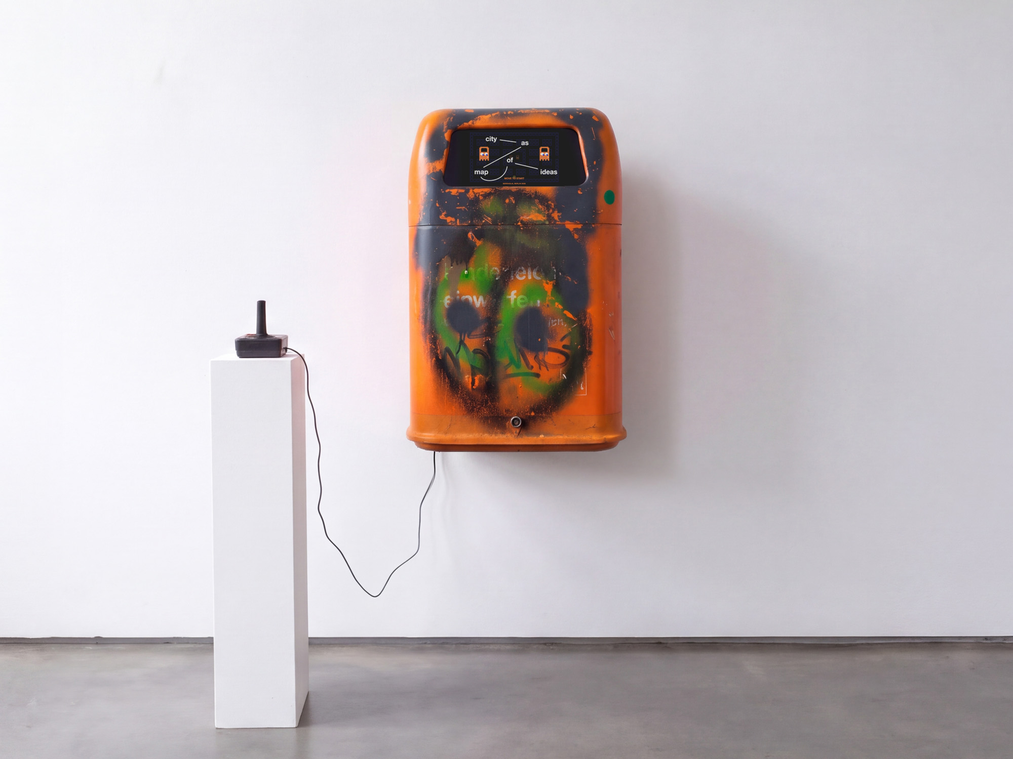
Waste of Time I, II2026
 1 / 3
Arriving in a new city like Berlin, I often felt lost. One thing kept showing up on every street: the orange BSR trash bins. Changing my relationship with them was one of the first things I wanted to do, turning the bin into a different kind of device.
Nobody spends time looking at a trash bin. You walk past it, throw something in, and move on. These ones ask you to do the opposite: stop and stay.
- Details
- Part of City as Map of Ideas
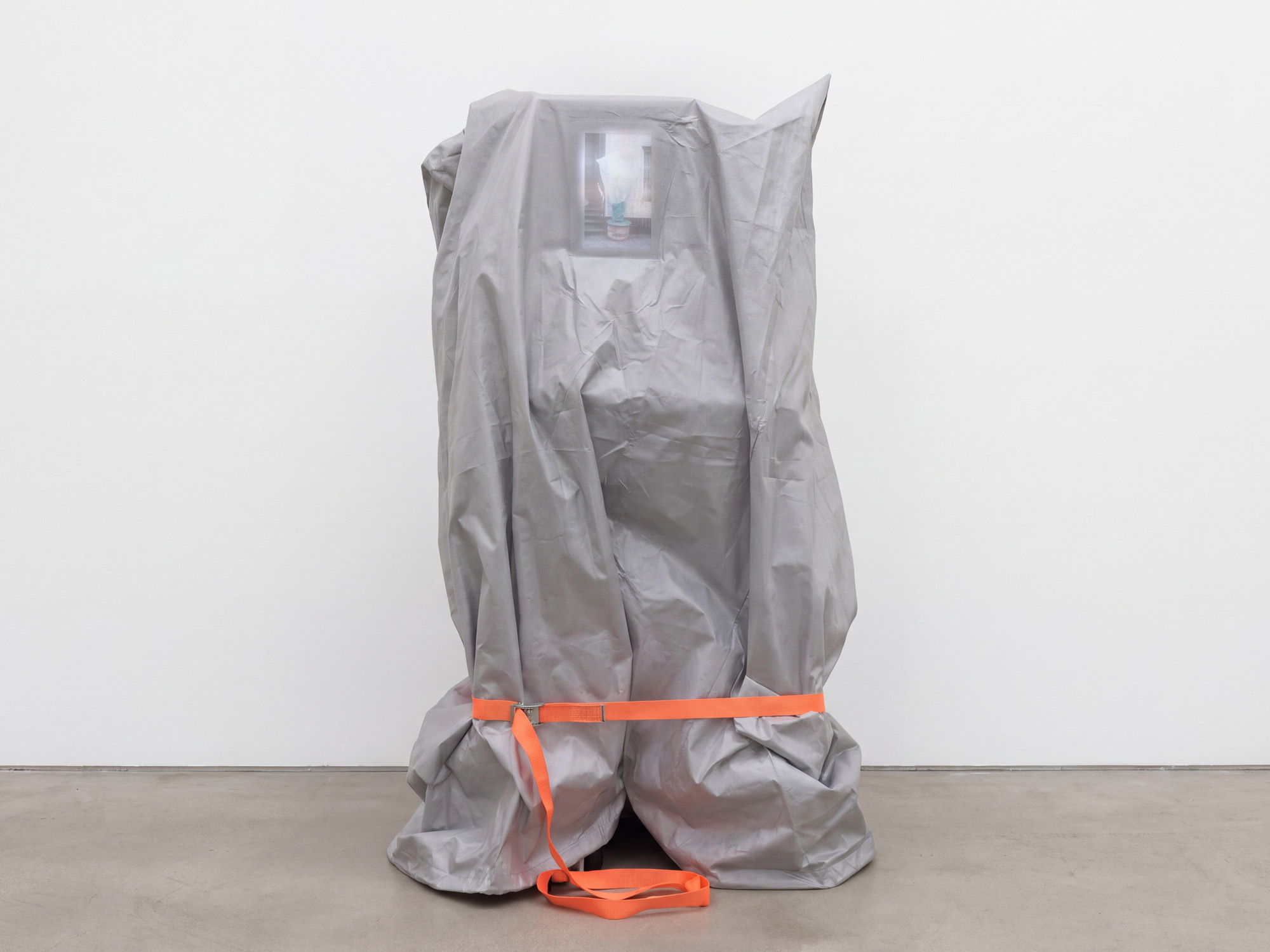
Urban Animals2026
 1 / 3
Walking first in Helsinki, then much more in Berlin, I kept noticing the same things: protective covers on parked vehicles, objects wrapped for maintenance and left on the street, shapes you walk past without thinking. Looked at for longer, it is never quite clear what is hidden underneath. It could be an animal or a person, something sleeping or something waiting.
In Urban Animals ten of these photographs were animated, so the covers move as if something were alive underneath. The videos play in a loop on a monitor that sits under a plastic cover, like the objects on the street.
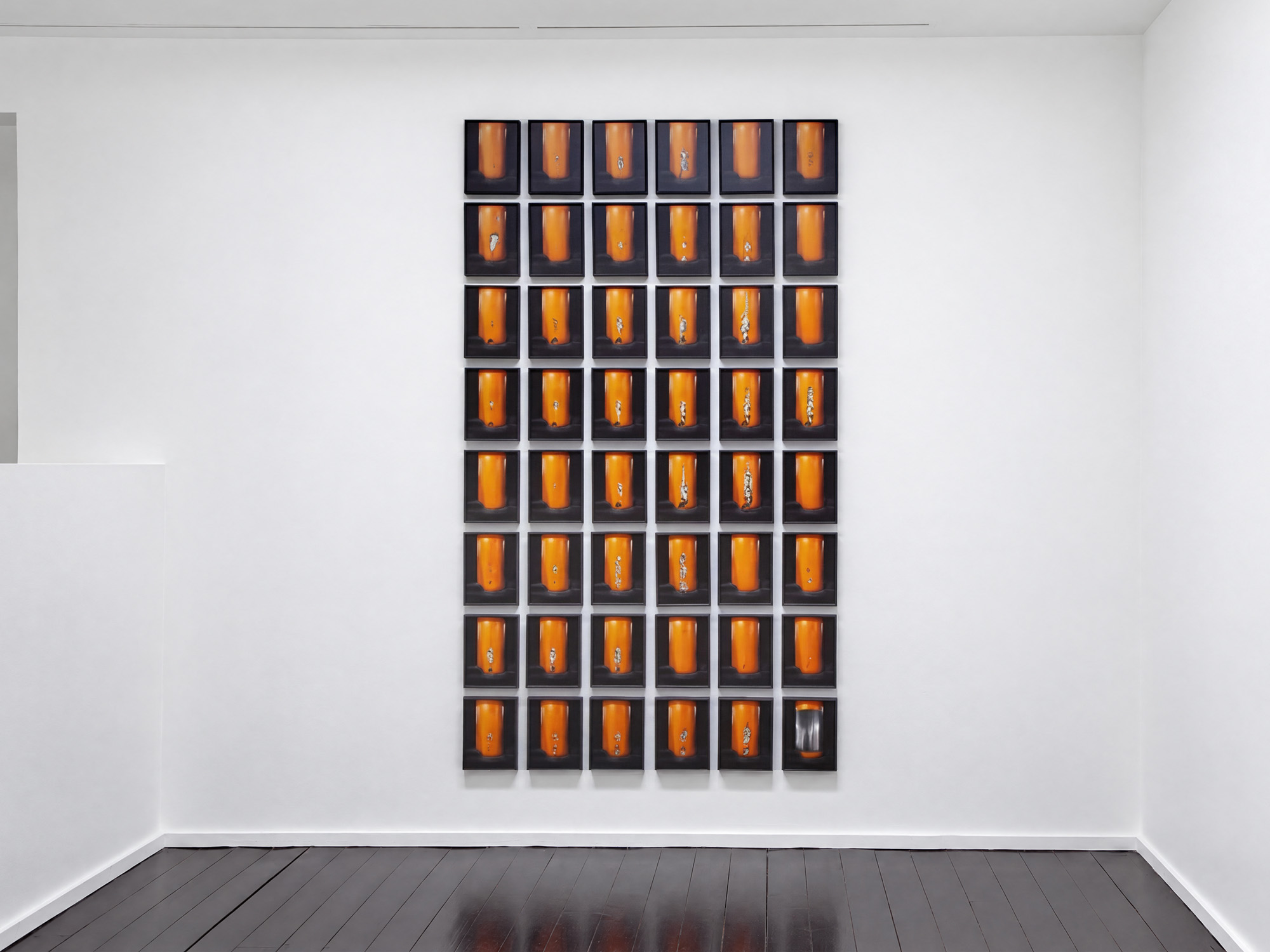
(Almost) Missed: Learning from a Parking Lot2025


 1 / 6
This photo book documents an orange pillar in a shopping mall parking lot over the course of 18 months.
Through small damages, subtle repairs, and layers of bright orange paint, it slowly became a kind of accidental monument: a record of unnoticed moments, daily routines, and the slow passing of time.
What if the things we overlook are the ones that speak the most? And maybe imperfect is just another word for alive?
- Shown
- Galleria Heino, Helsinki, 2026
- Available
- Book: Bookshop
Books as Art Practice2025


 1 / 4
Making books can feel a lot like painting graffiti on trains: you make the work, send it out into the world, and lose control of where it goes. This pocket-sized zine gathers eleven short reflections on books as an artistic practice.
- Available
- Bookshop
I Thought It Was Love, But It Was Just a Barbecue2025


 1 / 4
Covered objects in the street look like something else depending on who’s looking. The book plays with that, and with how much of what we see comes from our own stories.
- Available
- Bookshop
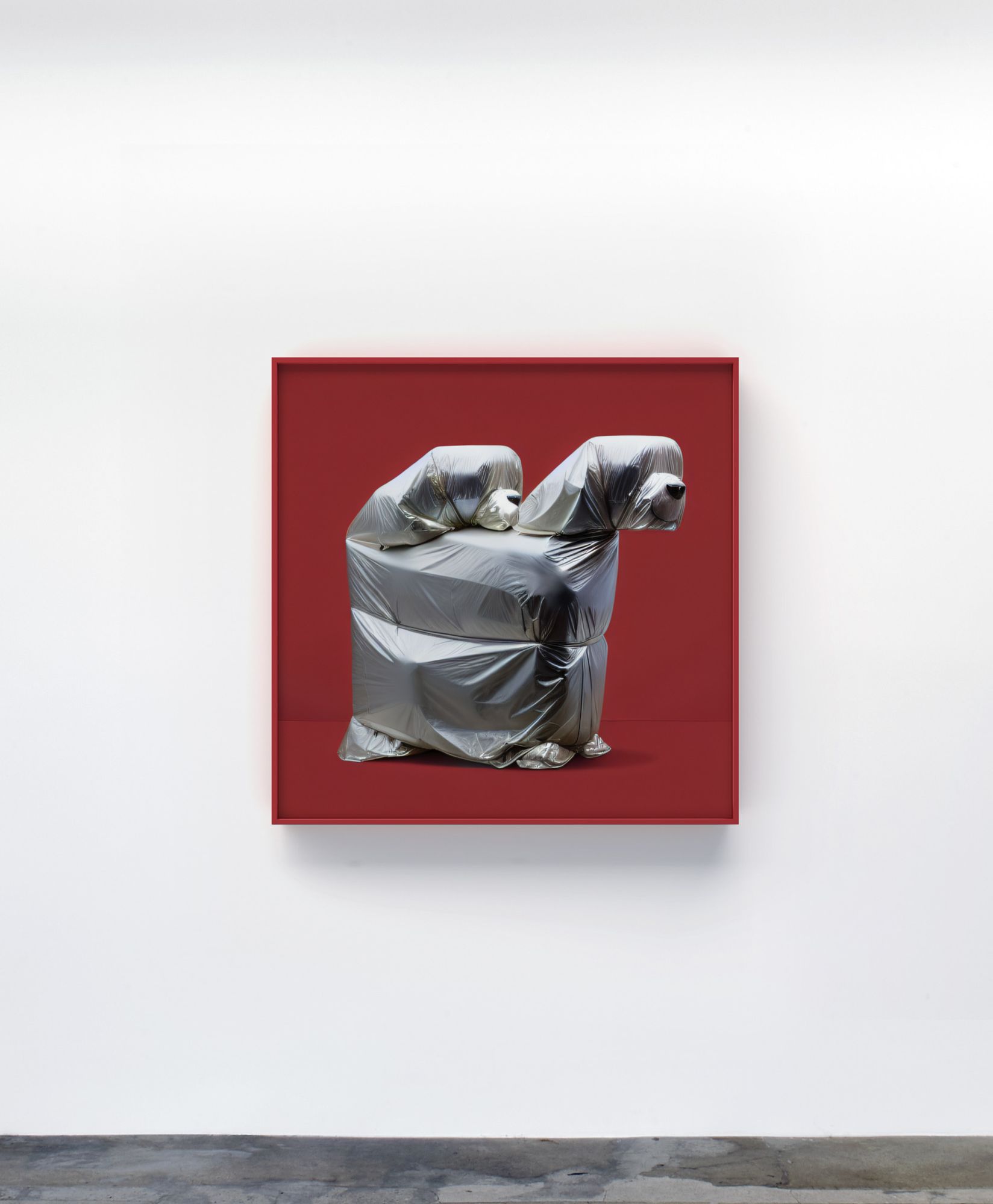
Wrapped Wonders2023–ongoing
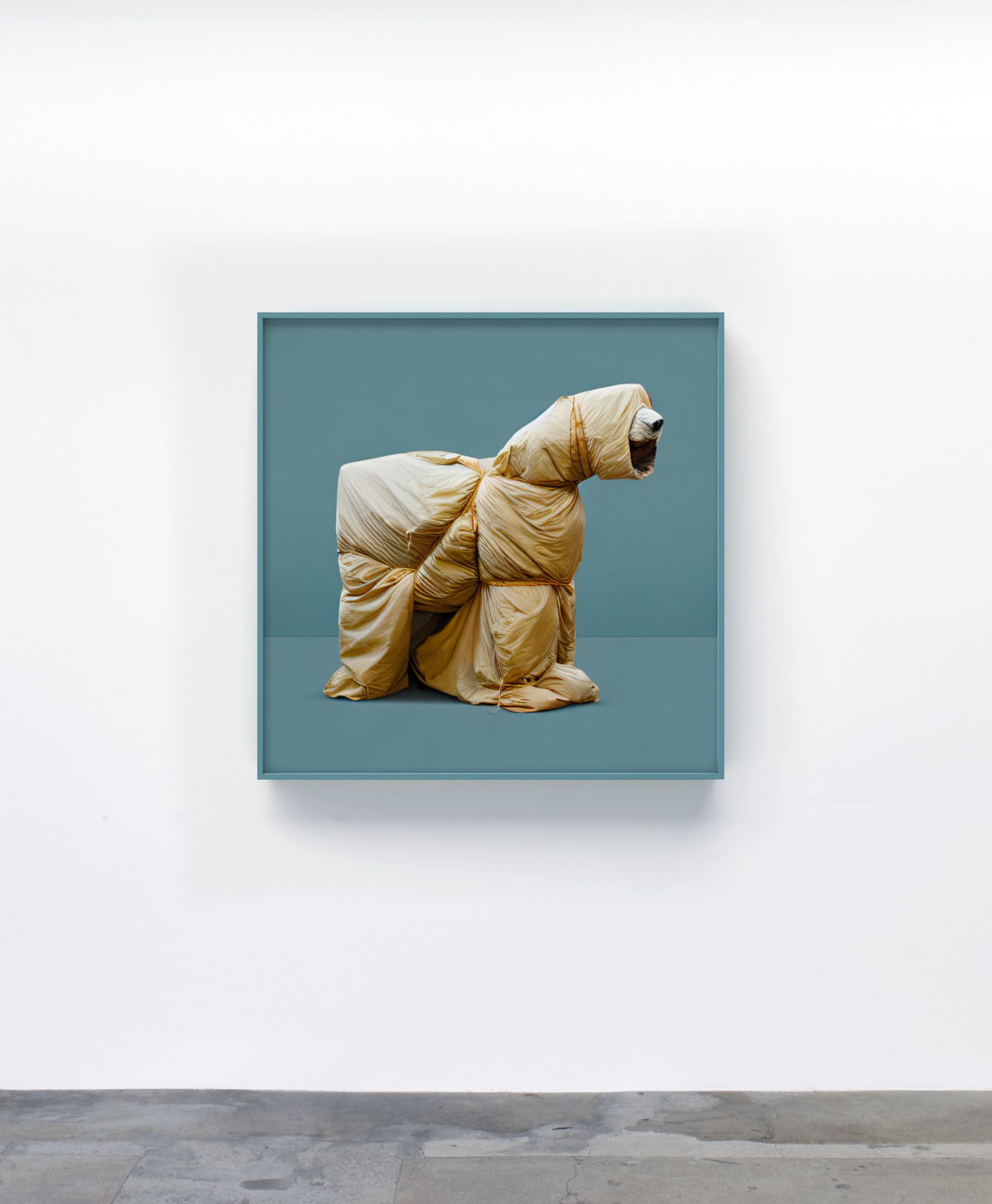
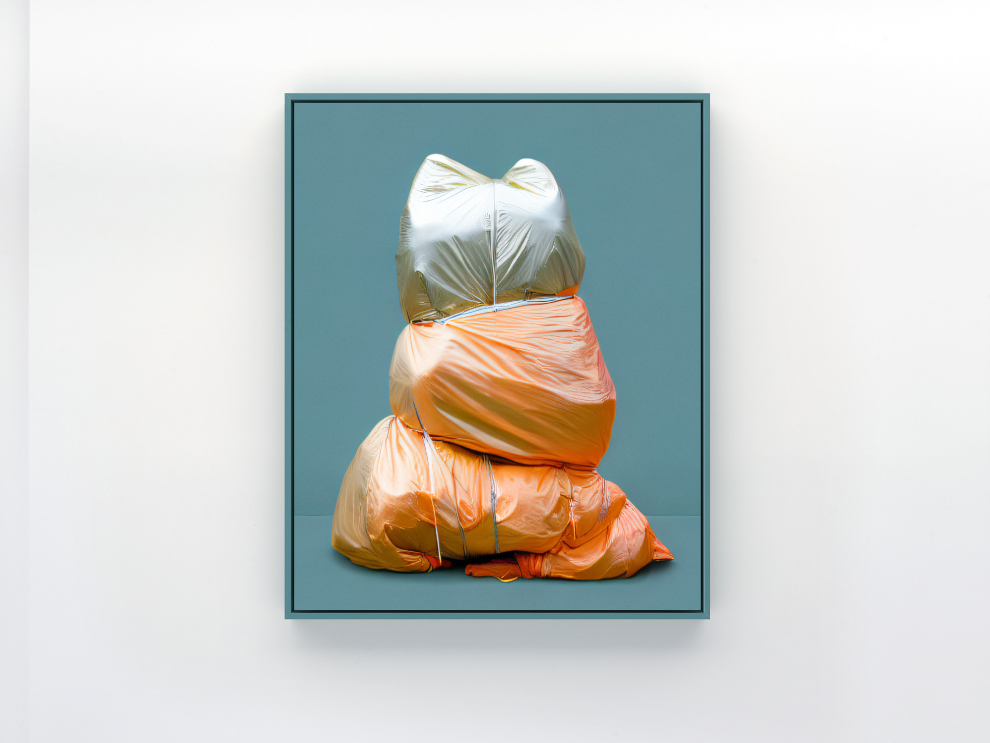
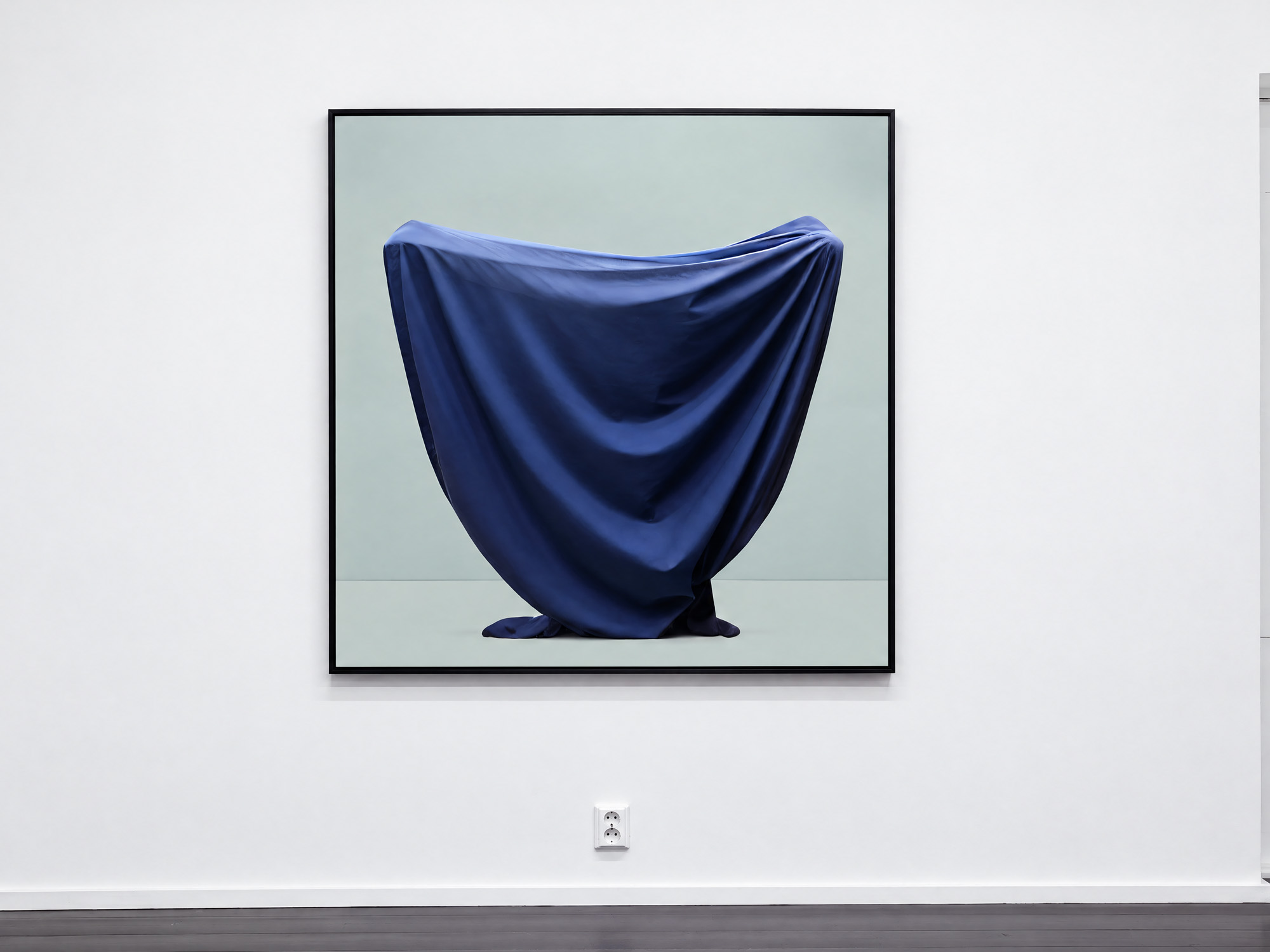
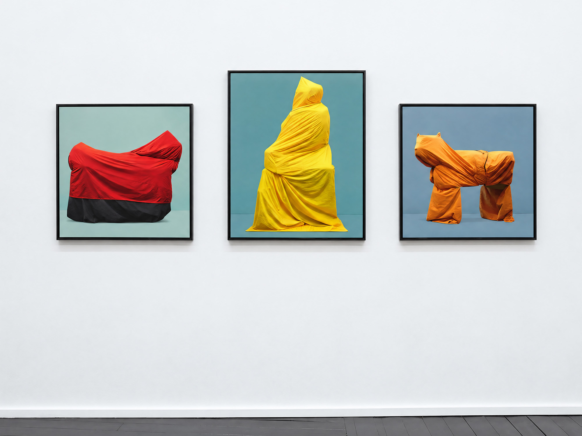
 1 / 7
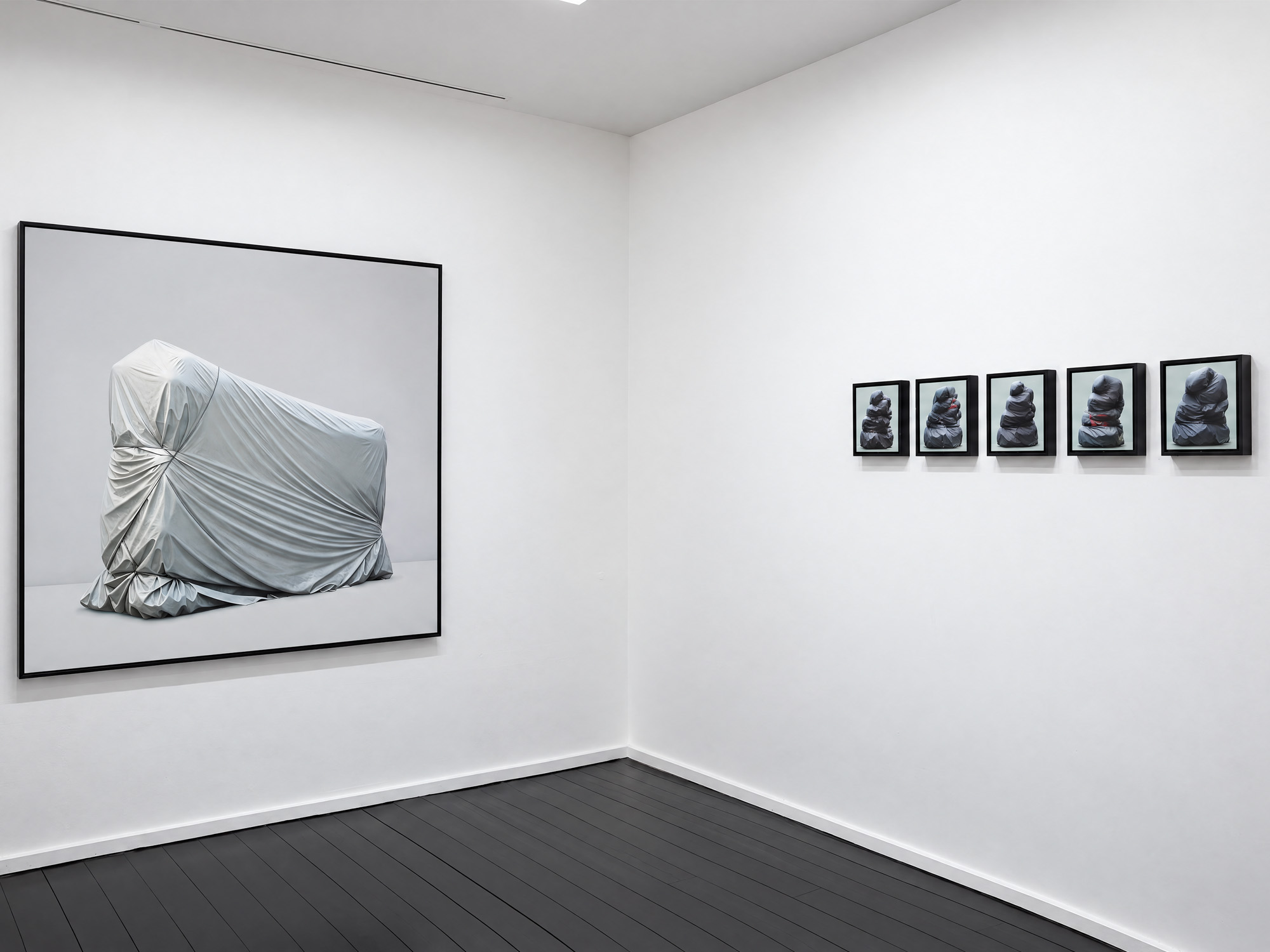
For years, I have photographed wrapped objects found in the street: accidental sculptures that recall Christo’s work, without anyone having planned them.
For this series, I developed a generative process trained on my own photographs. I used drawings and collages to guide it, pushing the images away from their original appearance and looking for figures hidden in the folds of the wrapped objects.
Some shapes begin to resemble animals or human figures. Others remain difficult to identify. The process also produced unexpected distortions and rough textures, which I chose to keep rather than correct.
The resulting images occupy an uncertain space between photography and painting.
- Shown
- Art Prolongs Life: Prescriptions from the HUS Art Collection, Kunsthalle Helsinki, 2024–2025
Art Center Purnu, Finland, 2024
OTOS, Cable Factory, Helsinki, 2023
Galleria Heino, Helsinki, 2023 - Notes
- The images shown here are only part of the series.
The City Is Ours2022–2024
 1 / 1
Six issues, each about one thing found on the street: discarded gums, graffiti removals, superficial damages, torn posters, manhole covers, involuntary sculptures. Every issue has two parts: a collective photographic investigation that tries to understand the subject, its typologies and its details, and a section featuring artists who work with the same material.
- Available
- Bookshop
Cone Wars2023


 1 / 3
In the late 1930s, two parties went to court over who invented the traffic cone. Neither won, because cones already existed. The book goes looking for what came before, mixing real history and invention.
- Shortlisted
- Finnish Photobook Award and The Most Beautiful Book in Finland, 2023
- Available
- Bookshop
Traces: Portrait of a Digital Life2014–2022
 1 / 1
People leave fingerprints behind on the things they touch, most of the time without even noticing. Nowadays, with the growing use of touchscreen phones and tablets, every day we leave hundreds of fingerprints and traces within the frame of that small screen.
Have you ever looked at the screen of your phone from the side? What kind of traces do we leave on the screens of our devices? And what can these traces reveal to others about our habits or identity? This is how Traces: Portrait of a Digital Life was born, a photo series documenting the finger traces left on a tablet screen.
At first look, the result might appear as a series of abstract paintings or drawings made without any rule or method. Looking more carefully, something else appears. Every image was generated by a logical and rational sequence of gestures: from writing an email to browsing a webpage, the traces left on the screen follow the precise rules and intentions of the user.
The result is a series of seven large-scale photographs, each revealing one user’s habits, emotions and some secrets that otherwise only the best detective would know.
- Details
- Series of seven, C-print on Silisec, 120 × 90 cm, edition of 3 + 2 AP, and 40 × 30 cm, edition of 7 + 2 AP
Limited-edition book - Shown
- Galleria Heino, Helsinki, 2022 (group exhibition)
- Available
- Book: Bookshop
Archive
Art Is…2023
 1 / 1
A word search on a free billboard in Montpellier. Only two words are circled: ART and IS.
Made for Affichage Libre Montpellier & Sète, a participatory project between mail art and street art by Arzhel Prioul and Mathieu Tremblin, with Éric Watier, Cédric Torne and students of ENSAM, 2023.
- Details
- Poster, 230 × 150 cm, on a free billboard (affichage libre), Montpellier, France. Drawn in black and white on a blank postcard sent by mail, then reproduced at billboard scale and pasted in the street
Toys for Us2021
 1 / 1
Babies have no concept of what is a toy and what isn’t. Sunlight shining through leaves, seen from a moving stroller, can be just as interesting to them as an expensive toy bought in a shop.
The first time I found a baby’s toy lying in the street, I wondered if it was really lost or deliberately thrown away. Over time, after finding several toys in the streets of different cities and countries, I started to believe that babies were throwing toys out of their strollers on purpose, and that with fewer toys they were actually much happier.
To a baby, the world changes rapidly. At birth everything is a blur, with visual acuity around 5% of an adult’s. But by the age of six months, babies have more or less adult levels of colour acuity.
Bright, highly saturated colours are a popular mass marketing technique because they attract the eye, and children tend to like bright colours even more than adults do. Modern toys are also designed with bright colours to increase a child’s attention span and support the development of the nervous system in the early stages of life. But do babies really need these kinds of toys anymore?
Nowadays people of all ages, especially children, are already surrounded by all kinds of visual stimuli, at home and elsewhere: screens, artificial lights, escalators, cars and traffic lights, shop windows and advertising. We all live in an overstimulated society.
Research has shown that overstimulation can lead to anxiety, insomnia, headaches and stress. Instead of a toy designed to stimulate our attention and senses even more, how can we offer some time for reflection and contemplation?
This is how Toys for Us was born, a series of baby toys painted plain white, to calm the senses and rest the eyes of your little ones, and your own.
- Details
- Series of six, digital C-print, 60 × 60 cm, edition of 5 + 1 AP
- Notes
- The images shown here are only part of the series.
This Painting Should Be Read2021
 1 / 1
Chipboard fences around building sites start clean, then slowly fill up with spray paint, adhesive tape, building signs and traces of removed graffiti. They become a record of the workers’ movements and intentions, and of accidents nobody planned. Like the tablets of ancient civilisations, even a small patch of fence can be read, if someone makes the effort.
The full title is This Painting Should Be Read (and Not Looked At). Each work takes these involuntary marks and proposes one possible reading, an abbreviation like “WB” for Welcome Back.
- Details
- Series of six. A spin-off of Signs Fiction
Signs Fiction2020–2021
 1 / 1
Over the years, construction workers seem to have developed a mysterious script made with adhesive tape, readable by only a few. What do these signs mean? Is this some sort of secret language? Or is there no meaning at all?
Fascinated by cities and by semiotics, I decided to create an artistic and slightly ironic visual statement about these found signs. I am not trying to reveal their absolute truth. Instead, I want to question our perception of our surroundings. Are things always as they seem?
When I started researching these tape signs, I had no idea what the final outcome would be. A photo-based project? A series of paintings? Or maybe a book? A science book, or more like a novel? In the end, the result is a bit of all these things mixed together.
- Details
- Artist’s book, second revised edition, 64 pages, 14 × 21 cm, hard case, sewn binding, edition of 200, Other Editions, 2024
First edition: 48 pages, edition of 100, each copy with a hand-applied tape cover, 2021 - Available
- Bookshop
City Walk Workshop2007–2021
 1 / 1
This workshop is aimed at anyone with an interest in art, visual perception and communication, at any stage of their studies or careers.
During the workshop, participants are invited to explore the city with new eyes, completing small assignments and documenting their findings with photographs. The aim is to create an alternative guide to the city, highlighting objects, colours, shapes and parts of the urban landscape that normally go unnoticed.
After the walk, the photos are viewed and discussed together with the group.
Free workshop kit
I receive a lot of requests from students and educators asking me to hold workshops. Because my time is limited, I can only do a few. This is why I created a free kit, with instructions for running the workshop without me. Everything you need to get started is in the kit: Download PDF.
- Details
- Workshop, held in schools and museums
Backwards2019–2020
 1 / 1
When we recognise that someone or something is trying to appear as something other than they really are, how do we feel? And how should we react?
In this case, when a painting tries to pass as art thanks only to its golden frame, what should we look at?
I don’t want to say that there is such a thing as “bad” or “false” art that doesn’t deserve to be framed or looked at. But sometimes, as in life, a careful look at what is, literally, behind things is worth it. Thus, Backwards was born: a photo series featuring the backs of paintings found for sale in flea markets and second-hand shops at prices from €20 to €150, frames included.
Unlike the fronts of these pieces, the backs allow us to fully admire “raw” compositions made without any aesthetic or artistic ambition. Are these among the most honest, sincere and spontaneous forms of expression?
- Details
- Artist’s book, 44 pages, 14.8 × 21 cm, sewn binding, Other Editions
- Available
- Bookshop
Contemporary Architecture in Painting2019
 1 / 1
Renaissance artists used images of “contemporary” architecture as the background of their paintings. How would a Renaissance artist react to our cities, built in the name of economic benefit and rationality?
This is a possible interpretation.
- Details
- Series of seven, digital C-print, Ø 70 cm, edition of 6 + 2 AP
City Wonders: Helsinki2017–2018
 1 / 1
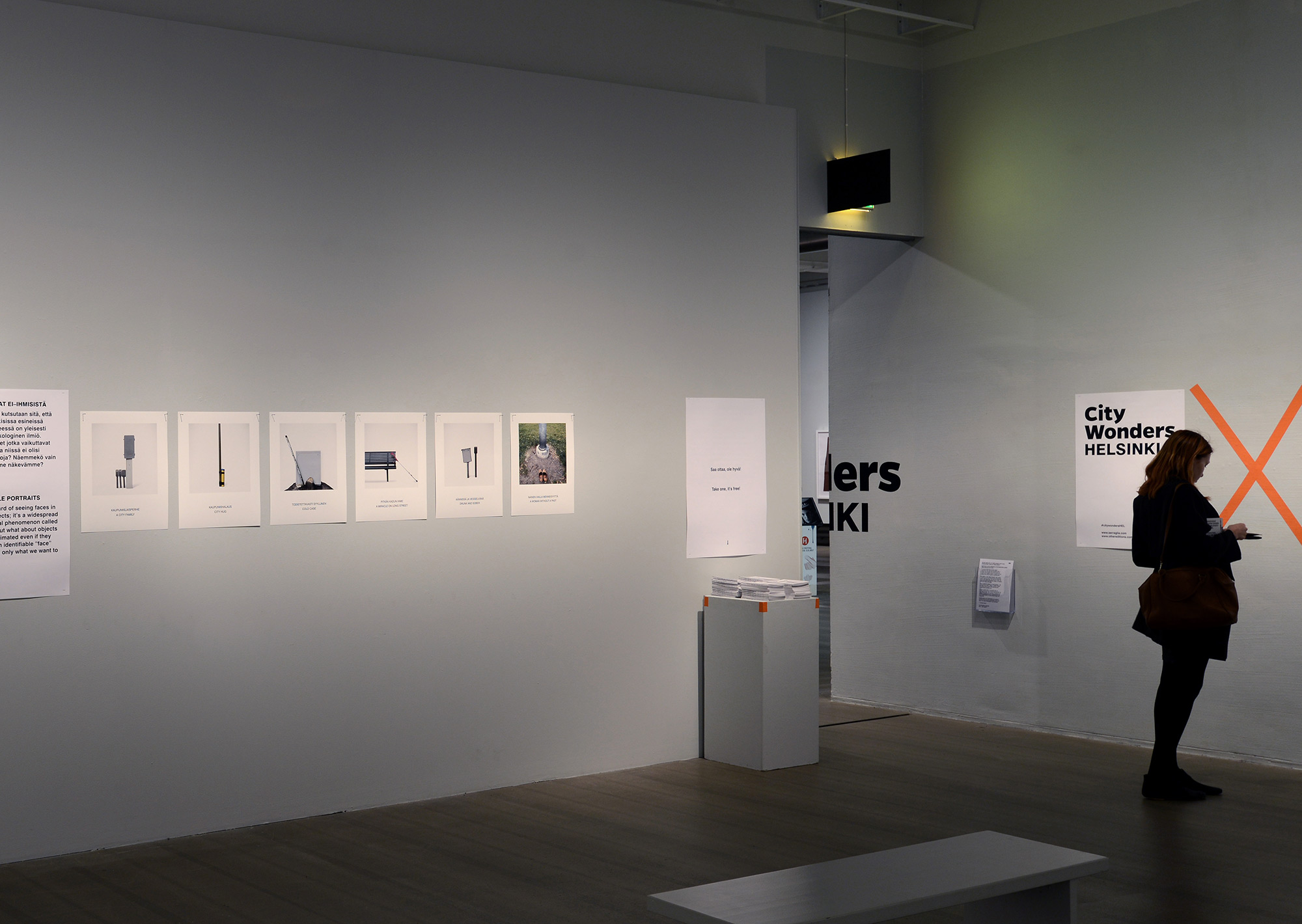
There are wonders and beauty all around us, but do we really see them?
City Wonders: Helsinki is a photo series of objects, colours, shapes and parts of the urban landscape that normally go unnoticed. Each image carries a story, revealing the unexpected in everyday life in Helsinki.
Blurring the boundary between what is framed and what is not, the exhibition invites viewers to explore the city with new eyes, and to observe it from an alternative, more curious point of view.
- Details
- Photo series and exhibition catalogue, Other Editions
- Shown
- Finnish Museum of Photography, Project Space, Helsinki, 2017
Secret Stories2014–2017
 1 / 1
I had been living in Finland since 2009, but my knowledge of Finnish was still very limited. Although English is widely spoken, I often found myself in unclear and incomprehensible situations.
Looking for visual clues to understand better, I began to observe people and interpret their gestures more often. This is how Secret Stories was born, a series of seven short films, each about one minute long, where people were filmed unknowingly in ordinary situations. Subtitles were added to make visible the dialogues and thoughts that would otherwise remain misunderstood or unrevealed.
But the series is not only about revealing imagined and paradoxical stories. It also invites us to observe everyday life with curiosity and imagination, because beautiful stories can happen anytime, especially when we least expect them.
- Details
- Seven HD videos, about 1 min each, shown in a loop on one screen with music, edition of 3
- Shown
- MUU Gallery Studio, Helsinki, 2017
MUU Gala, Helsinki, 2020
Art Is Everywhere2015
 1 / 1
In 2005, I did a street performance in Florence: a white canvas with a light grey sentence reading “Art Is Everywhere”, temporarily exhibited on the streets.
The aim was to create a temporary visual emptiness, a necessary condition for opening people’s eyes, so that they could see the interesting layers of scratches, marks, old posters and parts of the city that normally go unnoticed.
Within a few years, my passion for photographing cities, their scratches, marks, posters and other objects, led to a workshop, where participants were invited to explore with new eyes and to document their findings with photographs.
This book is the result of that experience. It sets aside the challenge of defining Art, and treats it instead as a trigger for new and different interpretations of what already surrounds us.
- Details
- Book, concept, text and design by Lorenzo Servi, edited by Helen Nodding, BIS Publishers, Amsterdam
In-Contro, Spontaneity and Planning2011
 1 / 1
Architecture is usually the result of a planning process that combines art and science. For pedestrians, the façade is the most visible result of this process.
Warehouses offer an interesting point of view on the design process, because they often show an unbalanced combination based on rational and economic choices. As a result, their façades look spontaneous and flat.
Plants and trees can grow in a variety of environmental conditions. In nature they grow without a precise order or pattern. In cities, on the other hand, the position of plants and trees is often planned, with a limited variety of species in specific areas. This is why it is very rare to find plants growing spontaneously in a built environment.
In-Contro (in Italian, incontro means to meet, contro means against) is a series of seven images from the industrial area of Kalasatama, close to the city centre of Helsinki, where spontaneity and planning meet in a built environment.
- Details
- Series of seven, digital C-print, 50 × 70 cm, edition of 7 + 2 AP
Mute Spaces2010
 1 / 1
The quality of space is critical for living. Humans are able to adapt to a great diversity of climates and environments and, especially nowadays, even to ugliness.
The aim of the project is to show silent spaces in Helsinki made by “mute” architecture. The images introduce an alternative way of perception, placed between the photographic language typical of built architecture and the digital images typical of unbuilt architecture. This intermediate language, between reality and image, shows new ways of perceiving the city, so that people notice things they didn’t see before. Hopefully the city can then be seen with new, more critical eyes.
Around 1965, Brian Coe designed an alphabet to find out how much of each letter could be removed without seriously affecting legibility. Can the same approach be used to make images? How many details can be deleted from a photo without losing the sense of photorealism? This is how the technique behind Mute Spaces was born.
- Details
- Three series of seven, digital C-print, 60 × 60 and 120 × 120 cm, edition of 4 + 2 AP
- Shown
- Helsinki Design Week, 2010
Helsinki Photography Biennial, 2012
Art Fair Suomi, Cable Factory, Helsinki, 2013
NordArt, Büdelsdorf, Germany, 2014
Parallel Worlds: Lines of Perception2008
 1 / 1
“There must be a threshold beyond which perception becomes interpretation.”
Hermann Rorschach, 1921
While I was walking through Florence, surrounded by the celebrated beauty of the Duomo and Ponte Vecchio, my attention was drawn elsewhere: to the worn markings of a zebra crossing. Summer heat, traffic and little maintenance had warped the painted lines into shapes nobody had drawn.
This observation became the starting point for Parallel Worlds, a series of photographs about the boundary between perception and interpretation. Isolated against a black background, these accidental forms invite us to look at familiar urban surfaces differently, allowing unexpected landscapes, textures and associations to emerge.
The series explores how a shift in attention can transform an ordinary detail into something entirely different.
- Details
- Series of seven, photographs on black background, digital C-print, 70 × 90 cm, edition of 7 + 2 AP
- Shown
- SESV, Florence, 2008
Unspoken Words2004–2005
 1 / 1
For one year I documented memories of memories in the Monumental Cemetery of Florence, known as “of the Holy Gates”.
On the gravestones, the photographs of the dead are ruined and their names can no longer be read. Which memories do they carry, from the past until now? And in the end, what do they want to communicate?
This is how Unspoken Words was born, a series of silent images and unspoken words.
- Details
- Two diptychs, digital C-print, 50 × 50 cm each, edition of 3 + 2 AP
- Shown
- SESV, Florence, 2005
Art Is Everywhere!2005–2008
 1 / 1
A white canvas with a light grey sentence, “Art Is Everywhere”, was temporarily exhibited on the streets of Florence in 2005.
The aim of the project was to create a temporary visual emptiness, a necessary condition for opening people’s eyes, so that they could see the interesting layers of scratches, marks, old posters and parts of the city that normally go unnoticed.
- Details
- Performance, street intervention
About

Data
SERRAGLIA [ˈsɛʀɑ jɑː].
Visual artist* designer and publisher.
Born 1979, Pesaro (Italy).
Lives and works in Helsinki, Finland (2009 to the present).
Fellow of the Berliner Leben Foundation, Urban Nation, Berlin (2026).
Represented by Galleria Heino (Helsinki).
Book distribution by IDEA Books (Amsterdam).
Short bio
SERRAGLIA is the alias of Italian visual artist, publisher and former architect Lorenzo Servi (b. 1979). His practice uses the city as a field for observation and visual research. Since 2017, books have been at the core of his work, published through his independent imprint Other Editions. His work has been shown at venues including the Finnish Museum of Photography, Galleria Heino, Kunsthalle Helsinki and Graphic Days Torino.
Full bio
SERRAGLIA is the alias of Lorenzo Servi (b. 1979, Pesaro), an Italian visual artist, publisher and former architect based in Helsinki since 2009.
Writing graffiti taught him to scan the city for spots to paint rather than seeing it as a backdrop. Training as an architect (MA, University of Florence, 2008) gave him another way of seeing it, through its textures and histories. From both he kept the habit of reading the city from a different perspective.
His work starts from walking. Like a flâneur, he wanders without a fixed destination and uses photography to investigate the city and collect raw material. Some photographs he transforms with digital tools, others become the cue for a different work. He then builds this material into narratives that most often take the form of books, and sometimes of objects or installations. His references include the readymade, Akasegawa Genpei’s Thomassons and Situationist ideas. His projects move between reality and fiction, and between art and non-art.
Books have been at the core of his practice since 2017, when he founded the independent imprint Other Editions, distributed worldwide by IDEA Books. In 2023 his book Cone Wars was shortlisted for the Finnish Photobook Award and for The Most Beautiful Books in Finland.
Bringing art into everyday life has long been part of his work. In 2010 he founded the Imagined Museum of Contemporary Art, in 2015 he published Art Is Everywhere (BIS Publishers), and he ran City Walk workshops in schools and museums.
His work has been shown at venues including the Finnish Museum of Photography, Kunsthalle Helsinki, Galleria Heino and Graphic Days Torino, and is held in the State Art Deposit Collection, the HUS Art Collection and the Heino Art Foundation. In 2026 he was a fellow of the Berliner Leben Foundation, hosted by Urban Nation, Berlin.
Why I don’t like calling myself an artist
John Baldessari once said, “I used to be very uncomfortable calling myself an artist, because I thought it was qualitative, not just a generic title.”*
These words have always resonated with me.
Even today, the words “art” and “artist” often feel overused, and at times emptied of their meaning.
Others are free to call my work art, or to call me an artist. I just choose not to claim the title myself.
Works in collections
- State Art Deposit Collection (Finland)
- HUS Art Collection (Finland)
- Heino Art Foundation (Finland)
- Private collections in Italy, Belgium, Finland and the USA.
Grants
- 2026 Taike, project grant
- 2024 Taike, project grant
- 2023–2024 Kone Foundation, research grant
- 2022 Grafia, book production grant
- 2017 VISEK, project grant
- 2017 Taike, project grant
Member of
- MUU artists’ association, Finland
- The Union of Artist Photographers, Finland
- Grafia – Association of Visual Communication Designers in Finland
Articles/interviews
- Collater.al
- Mag Culture
- Frizzifrizzi (In Italian)
- Introduction @ West Carrollton High School, Ohio
- PIG Magazine N. 34 (interview in Italian)
- World Architects
- Designboom
Areas of interest
- Built environments
- Urban readymades
- The urban quotidian
- The overlooked
- Domestic places
- Relationship between images, words and language
- Relationship between art and viewer
- Connecting visual arts with non-art audiences
- Series of images
- Printed matter
- Post-graffiti
- Humor and art
A complete portfolio/CV is available on request.
Other Editions
Other Editions is an independent imprint based in Helsinki, founded in 2017 to take the work beyond traditional art spaces and share it in a more democratic way.
- Distribution
- IDEA Books, Amsterdam
- Available
- Bookshop
Art statement
Cities are full of things nobody designed to be looked at. I am interested in these accidental elements of the urban environment: things that go unnoticed, lose their original function, or acquire a different meaning simply by being seen from another perspective.
Duchamp had to carry a urinal into an exhibition to make people look at it. Akasegawa Genpei, with his “Thomassons”, showed that the object can stay where it is. What has to move is the way we look. This shift between seeing and interpreting is central to my practice.
My way of looking at the city developed through two different experiences. As a graffiti writer, I scanned the streets for spots to paint, and for the signs other writers had left behind. Later, studying architecture taught me to read buildings through their textures and histories. Both experiences shaped an interest in the city as a place full of unintended compositions and visual clues.
Photography is my main tool for investigating and collecting this material, but rarely an end in itself. I rework images with digital tools, combine them with other material and develop them into visual narratives. Books are the most frequent outcome of this process, though ideas also take shape as objects and installations. I am interested in the gap between what things are and what they might be.

Contact
Newsletter
Every now and then, I would love to share good things (new art, thoughts, and interesting books) with you. I don’t like getting spam or crap I don’t want, and I’m not interested in doing that to anyone else.